Until two years ago I didn’t pay much attention to font-size. That was a mistake. Font size matters for two reasons:
- User experience: I prefer sites with slightly larger font, especially on mobile. I don’t like straining to read. The better UX you offer, the longer folks stick around your site.
- Ad revenue: Larger font means the article takes up more digital real estate which means more ad revenue.
The thing with font-size is the optimal size varies from WordPress theme to theme. Which means you need to play around with it. When I’m using a new theme I check out different sizes on all devices until I get it just how I like it.
Would you like to save this?
These days I use three themes. For each, I have a different font size setting. Here’s how big my font sizes are by WordPress theme I use:
The three themes I’m using these days are Trellis, Astra and Kadence. FYI, FatStacks currently uses Trellis.
1. Trellis theme:
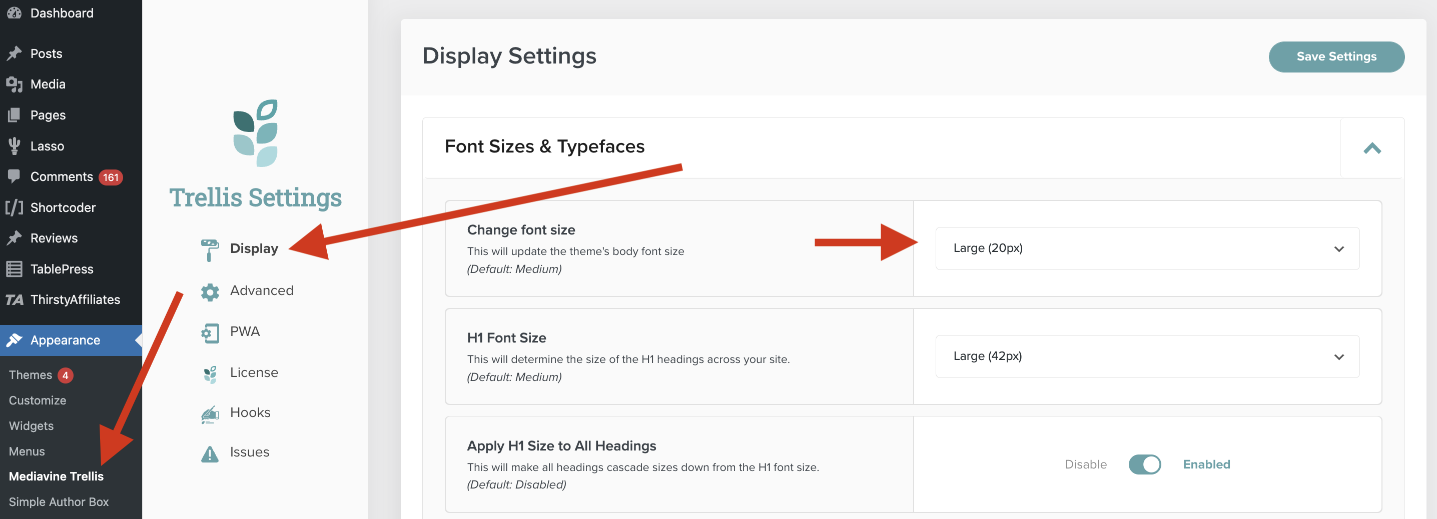
Font size: Large (20px) for all devices. Trellis doesn’t offer different sizing by device (unlike Astra and Kadence themes). Here’s how I set the font-size with Trellis:
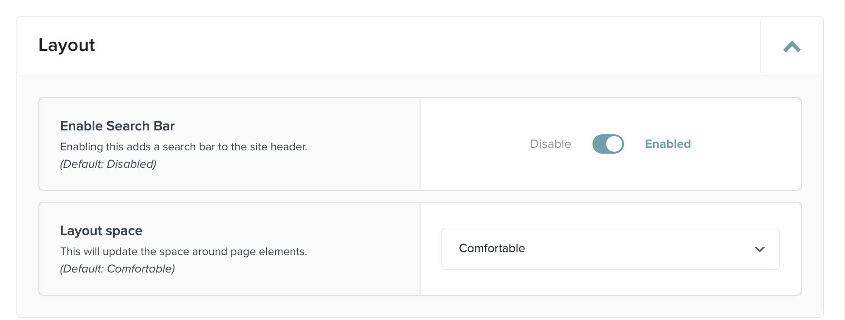
To adjust font-size with Trellis theme, go to Appearance => Mediavine Trellis => Display and then “Change Font Size”.
2. Astra theme:
For Astra, I set the font sizes as follows:
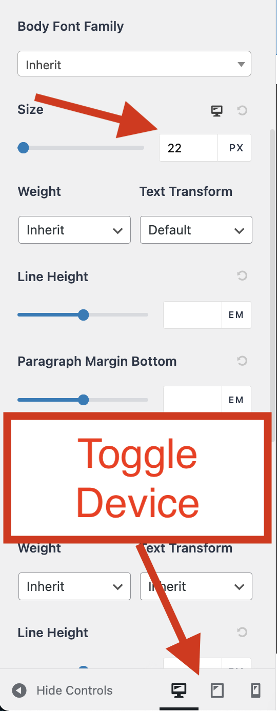
- Desktop: 22 px
- Tablet and mobile: 21 px
To change font size with Astra, go to Appearance => Customize => Global => Typography then look for “Size” and change to desired font.
3. Kadence theme:
For Kadence theme, I set the font sizes as follows:
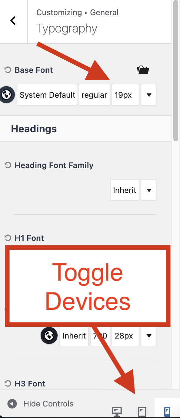
All devices (desktop, tablet and mobile): 19 px
To change font size with Kadence, go to Appearance => Customize => General => Typography and make your changes in the “Base Font” Fields. Like Astra, don’t forget to toggle to tablet and mobile to set font-size on those devices as well.
FYI, Fatstacksblog.com currently uses Trellis theme.
Don’t forget about line spacing
Line spacing is nearly as important as font size. You don’t want your font lines crunched together. I like plenty of white space. Here are my settings for the three themes I use:
Trellis: Comfortable
Astra: I go with the default
Kadence: I go with the default
IMPORTANT: The best way to figure this out is to check your site out on all devices and make adjustments as needed. Like font-size with Astra and Kadence, you need to toggle among desktop, tablet and mobile to adjust line-spacing for each.
Title and heading font size matters too
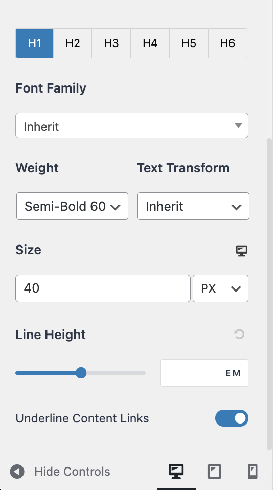
I like big titles and headings so that it’s clear to visitors they are titles and headings. Here are my settings for the same three themes:
You access the heading font size change area in the exact same way as font-size changes set out above.
Trellis
Astra Theme
- H1: 40
- H2: 29
- H3: 28
- H4: 24
Kadence Theme
Same on all devices.

What is a good font for your blog?
I’m not into fancy, custom fonts. I disable Google Web fonts for all sites to speed up my sites. I certainly don’t load in any custom fonts.
What font do I use for my blogs?
I use the inherit or default font from each theme. I’m not terribly particular.
I do not like serif fonts at all. That curly cue stuff annoys me and looks too cutesy. As long as the default is sans serif, that’s what I use.

Jon Dykstra is a six figure niche site creator with 10+ years of experience. His willingness to openly share his wins and losses in the email newsletter he publishes has made him a go-to source of guidance and motivation for many. His popular “Niche site profits” course has helped thousands follow his footsteps in creating simple niche sites that earn big.
