
Do you know that 67% of your visitors will leave your website if the navigation annoys them? A good blog and website navigation are essential to success as it affects traffic, how much time a person spends on your site, and conversion rates.
Due to the advancement of the internet, there are many speculations about the different kind of navigation menus. Navigation is one of the major elements that affect the user experience and a blog or website without navigation is unimaginable.
Consider your website is a city. You have just landed at Singapore, Dubai, Rome or any other desired destination of your choice. You know what places you want to see, but you have no idea how to get there. Most cities have signs that can help guide people to a certain place. Signs also help engage people. You might not have thought about visiting the Colosseum, but if you see a sign pointing that it’s nearby, you may be persuaded to visit it.
Blog and website navigations are designed with the same principle in mind. Without navigation, visitors can’t figure out where to go or what pages are worth seeing. They won’t be able to find your product listing page or your subscription page.
The purpose of navigation is to help explore the website further. It needs to inspire curiosity in people and convince them to click on links. Good website navigation will allow visitors to go from one page to another without any frustration. If you have done a good job, visitors will leave your site with the intention of coming back again, subscribing to a newsletter, or even purchasing a product or service.
Here are some of the modern new navigation options that can work like magic for your blog or website:
Interactive Navigation

These types of interactive navigation menus consist of typically a horizontal bar with elements that provide interaction when a visitor hovers over the link. This is one of the coolest types of navigation option as it offers a blend of static, dynamic and interactive elements which are all mixed together to catch the eye. It promises an engaging, inspiring and interactive experience to the user. However, because of the many moving elements, these navigation options are not very compatible with all sorts of browsers or mobile devices.
Sticky Nav Bars

As the name indicates, a sticky navigation bar is a website menu, typically displayed horizontally at the top that stays in place and does not disappear when you scroll down the website. This prevents you from going all the way back up to the website header and losing your place in the scrolling page. It helps users navigate the site from anywhere on the page.
Because of CSS and jQuery plugins, a lot of website themes now come in-built with the sticky menu as a default feature. This type of navigation also works great for mobile devices as the screen is longer and thinner there.
If your site has a lot of pages to navigate to, it is a good idea to employ a sticky nav menu, as it helps in user engagement and keeps visitors longer at your site. Some sticky nav bars also shrink in size as you scroll down so that they become less invasive and lets you view the page content better.
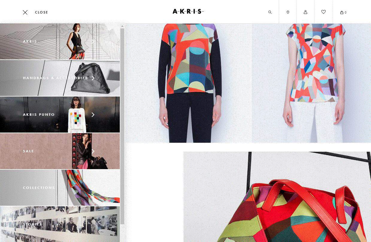
Sidebar static navigation has been trending for several years now. Although most designers say that these menus work better for compact and sleek websites, there are a lot of blogs and magazine who still employ this style of navigation.
Most websites use a static bright colored panel on the left side of the page which can display all the links quickly and effectively. Meanwhile, you can scroll down the web page without your sidebar going anywhere. This makes for great user experience as all the relevant links are available at your fingertips.
Very similar to the static sidebar, except this navigation option comes with a scrolling or slide-down option so that visitors can view a larger list of pages than what can be seen with a static bar. A large number of modern websites are now employing the vertical sliding navigation trend and it works very well. This navigational option is very popular with creative agencies or portfolio websites that push the envelope of traditional website design.
This design works well on a full-screen layout rather than a grid web design. A vertical sliding sidebar is not easy very easy to design and sometimes working it can be quite tricky if you are using a mobile or touch-based device. Still, if you are curious to try cool new navigation ideas, a vertical sliding bar can be a great idea.
Parallax Navigation

Parallax navigation or parallax scrolling involves consist of a web layout with the main background of the page moving at a slower rate than other elements on the foreground. This navigation option is graphic-based and gives the webpage a 3-dimensional effect.
Coupled with several visual and moving elements, the parallax website keeps thing interesting and prevent visitors from getting lost in the site.
Depending on the type of website, parallax can also be used sparingly in websites to give a touch of added dimension and help the foreground and important elements pop out.
Hamburger Menu

The hamburger icon is the menu button that is typically found on the top left or top right corner of a website. It is named so because the icon consists of three short horizontal lines stacked on top of one another, giving the look of a hamburger sandwich. This is usually found in mobile-friendly websites or modern techno-vibe desktop websites.
This is one of the most popular types of navigation button as it brings all links together in one place without adding a lot of clutter. This type of menu is very discrete, stylish and dynamic. Even though it is now a leading standard in mobile navigation, some less tech-savvy people find it hard to find this type of hidden navigation options. Therefore, adding the word menu next to the button may make navigation easier for such visitors.
Multimedia-based Menu

A multimedia-based menu consists of several visual elements like images and videos that are present in the items of a navigation menu. This wonderful, engaging option is all thanks to the advancements in technology that allows us to add lots of multimedia without compromising on the functions, accessibility, and performance of the website. Therefore, this type of attractive, modern and trendy navigation is fast becoming a must-have for dynamic and stylish websites.
The multimedia-based navigation makes use of a variety of different type of navigation options like the hamburger menu and the footer navigation and highlights only the most important part of the description.
Table of Contents

We know that Google loves long-form content and hence bloggers are now striving to write longer and lengthier pieces of content. Although this is a great practice according to the search engine, it can leave readers unable to get their bearings. To make things simple, many websites add a table of content at the beginning of their articles which categorizes them into different sections. This way users can just click on the link of the section they want to go and they will be brought there without any endless scrolling down the page. This helps the article look less intimidating and does wonder for the user experience.
The most prominent example is that of Wikipedia which has used tables of content since its creation.
Related Post Navigation

One of the most important types of navigation options, usually used in blogs, news sites, and product listings, is the related post navigation. This type of navigation consists of links to other featured blog posts, news items, or products, inserted in between, above or beneath the main content.
The biggest advantage of this navigation option is that it offers similar content that visitors may find interesting. The related post navigation encourages visitors to browse through other similar offerings and posts on the site, increases engagement, reduces bounce rate and prompt a purchase.
Mega Drop Down Menus

Drop down menus have been known to be controversial. For one, they can be difficult for search engine bots to crawl. For another, they can be annoying for visitors who are not interested in looking at a long list of web pages. They also make visitors miss important pages. However, one type of drop down menu performs very well. That is the mega drop-down menu.
Mega drop-down menus always work very well on websites which present certain industries like sports, online news, and e-commerce stores. The mega drop-down menu is a multi-function, multi-column component which spans almost the entire breadth of the screen. It can also balance elements like videos, images and even shopping carts. Since it is a very complex component, it can sometimes make the page go unresponsive, especially on mobile browsers. However, it is one of the best options if your website is offering a huge range of diverse services or products.
The biggest advantage mega drop-down menus offer is that visitors can get an idea of the type of content a diverse website offers. Therefore, there is a huge number of users who love this style of navigation.
Single Page Dot Navigation

One of the trendiest types of navigation seen these days is the single page dot navigation. This involves a series of cute little circular icons located on the left, right or center of the screen. Each dot represents a different section of the page. When a visitor hovers over or clicks on a dot, he is brought to a section of the webpage or a slide that is linked to that dot. The dot which the visitor clicks is highlighted to mark the user’s position on the website.
This type of navigation is great for when you want to show a large number of products on a single page but do not want to take up a lot of space. In fact, the single page dot navigation works very well in conjunction with other navigations like drop-down menus and sticky top navigation bars.
Universal Navigation

Some companies are conglomerates and have multiple brands under their name. These companies often have a universal navigation menu across the entire website. As the name suggests, this navigation option includes all the different brands, services, and products that the parent brand provides.
One of the best examples of such a navigation type is Disney, which owns a TV channel, movies, theme parks, games and more. Universal navigation makes sense in this situation since it draws attention to all the Disney products. This navigation is also not inclusive to conglomerates. It is also used on networks of websites like those owned by Univision Communications, including Jezebel, Deadspin and Lifehacker and the navigation links to all seven brands that were previously owned by Gawker Media.
An advantage of this type of navigation is that it lets users know what other sites are part of the website’s network and helps to create a successful brand identity and brand awareness. This can help visitors cross-pollinate across the network to all the websites.
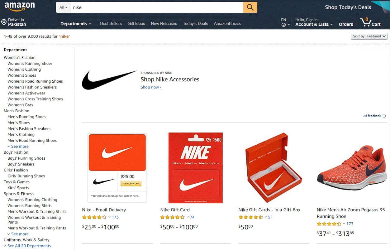
Breadcrumb Navigation

In the story “Hansel and Gretel,” the children leave a trail of breadcrumbs to find their way back home. The breadcrumb navigation, or breadcrumb trail, works on the same principle. These are hierarchical navigation links that appear on the top of a web page in tiny fonts and show the visitor their location in the website.
The breadcrumb schema shows the links of the category the page you are on is assigned to, the sections of the site in which it exists, and leads back to the homepage. Sometimes, the breadcrumb navigation also shows the name of the page which you are on but that is not hyperlinked.
In the case of our Amazon example, the book belongs in the “Genre Fiction” category, which is part of the “Literature & Fiction” section and leads back to the main “Books” section on the Amazon website.
Fat Footers Navigation

The footer navigation is similar in appearance to the traditional menu bar at the top of the site. However, the main difference is that this is located at the bottom of the web page. Because of this, it is called the footer navigation.
In many sites, the footer navigation usually consists of the contact us, privacy and legal links; however, it has now become quite typical to display email signup fields, social media links, and even product page links in the footer menu.
Most visitors scan through the footer menu as the last resort. Plenty of websites, especially retail websites, use the footer menu to show links to pages that could not be shown on the header menu.
Responsive Subnav Menus

People are now using their mobile devices more than their desktop computers. Keeping this thing in mind, developers have come up with a new and more efficient navigation system called the responsive subnav menu. This subnav menu appears small — which is good for mobile screens — but can be expanded to show hidden categories at the press of a button.
Sites with responsive subnav menus consist of a small plus icon, an arrow sign or a color change, which indicate that the menu contains subcategories.
Top Story Carousels

The top story carousel navigation option is fast becoming a trend on high-traffic news sites and blogs. Many of these major sites can publish dozens of posts each day and adding a simple carousel at the top of the page can give visitors a chance to look at the most recent posts. The articles in the carousels are updated and curated dynamically and can be styled to look like thumbnail images.
This type of navigation is perfect for high-volume websites and blogs and can give a boost to eh user experience. While on a page, visitors can find out about multiple different stories that they might be interested in and they will find more time exploring the site. This increases engagement time, improves user retention, and reduces bounce rate.
Slide-out Menu

This is another one of those “hidden” navigations, similar to the hamburger button. Slide-out menus are popular for mobile devices which have a thinner screen and do not have sufficient space to show content as well as the menu. Hence they have received a huge amount of popularity and designers are now implementing them in desktop websites as well.
The slide-out menu is indicated by a visual clue, like an icon, for example, an arrow, or a small text, which when pressed brings out the menu. Typically, the slide-out menu appears on the left side, though these days it can come from the right, the top, and even from the bottom.
Navigation is an essential part of any website’s design and designers have to pay particular attention to the type of navigation that is not just suited to the client’s needs but also reflects the voice of the company. Apart from this, here are a few tips you need to follow to make sure your navigation works in the best possible ways:
- You need to plan your sitemap at the start of every project. Simply put, a sitemap is a list of URLs and web pages on a website. This means it is one of the best navigation tool possible, from the search engine perspective.
- A website’s navigation should ensure that all its users should know their position on the site, where the site will lead them and which pages they have been through.
- The best websites do not come with just one type of navigation but offer a combination of several modern navigation sites. For example, a mobile-friendly website can have a hamburger button, plus a slide-out menu, a footer and a sticky header for easy navigation.
- All navigation options should also follow the web conventions so that visitors should know where to find certain functionalities.
- It is a good idea to use responsive website navigational elements like hamburger buttons and slide-out menus on websites, wherever appropriate.
Although there are several different kinds of navigation options, both traditional and modern, it is the choice of the user to decide what navigation they wish to put up on their site, after weighing their benefits and limitations. When it comes to navigation, the trends are truly dynamic and every new year sees a whole new range of stunning menus. What type of navigation your website deserves depends entirely on you.

Jon Dykstra is a six figure niche site creator with 10+ years of experience. His willingness to openly share his wins and losses in the email newsletter he publishes has made him a go-to source of guidance and motivation for many. His popular “Niche site profits” course has helped thousands follow his footsteps in creating simple niche sites that earn big.


Interesting overview, Jon.
Please allow me one question: you heavily use the table of content (as in this post).
Do you have any statistics on how much users really click on the TOC?
Also it would be interesting to know if the SEs see the TOC as internal links, increasing relevance of a page (even though it is self-referencing in the end).
Thanks in advance for any feedback/ideas.
Hey Tom,
I have no way of determining how much TOCs are used/clicked as far as I know. I doubt they help with SEO being internal links. I use them merely for better user experience. However, they may help get sitelinks in SERPs, but I’m not sure.