
Data can actually make your posts look more credible, which can increase your audience due to the reliable-looking content. However, bloggers can often face issues with how to best present such data. It can be really boring to look at statistics and figures endlessly. This can make it harder to keep your audience around since it can be quite hard to comprehend and boring.
The best way that people can digest hard data is through visuals such as charts and graphs. Visual data can give your blog the authority and credibility it needs, as well as improve the overall look of the blog. Graphs are usually images rather a dynamic media insertion. Such images can definitely get your point across; however, the biggest problem that they have is that it can be difficult to update the data. The numbers can change and it can be tough to keep going back to old posts to update them.
It is better to add dynamic graphs that can be easier to update. There are a number of chart and graph WordPress plugins that you can install to ensure amazing looking data. This can boost sales and attract a better audience.
WordPress Charts

WordPress Charts is the most simple and easy to use solution to make your blog look more interesting and credible. You can create animated charts using HTML5 and Chart.js. There are six main types of chart types that you can design: doughnut chart, polar area chart, line chart, pie chart, and radar chart. You can insert them into your post or page easily via widgets or shortcodes.
The main media menu has a shortcodes area that can look wonderful in your WordPress admin area. Each chart has a different shortcode that is available on the interface. You can use the dozens of shortcode attributes to create your charts.
The best part about this chart plugin is that the charts are animated and load quickly. They can make your page look absolutely fantastic and professional. You can also modify the attributes and values in the chart through the shortcode whenever you like. This makes updating and adding simple charts really easy for bloggers. However, if you want to add more complex charts into your blog, this plugin can become frustrating due to lack of options. In such a case, it is better to go for more advanced plugins.
Visualizer

Visualizer is a really versatile and interesting WordPress plugin designed by ThemeIsle. There are two versions available: free and premium. In the free version, you will be able to create column charts, pie charts, line charts, geo charts, area charts, bar charts, scatter charts, and tables
When you install the plugin, you will be able to easily locate the button for Visualizer in the WordPress classic editor toolbar. If you are also using the Gutenberg plugin, you will see the option for Visualizer in the main block menu. Do make sure that the visual editor mode is turned on or else you won’t be able to see the button. You can easily upload the data for your chart or file through a CSV file through direct uploads or imports via URLs.
In the pro version, you will get four extra chart types including timeline charts, combo charts, gauge charts, and candlestick charts. The best feature in the premium plugin version is the ability to design new charts from pages and posts. There are also more additional charts available as well which can add functionality, ability to edit, and creating private charts.
Easy Charts

Easy Charts can help you create a more visually appealing WordPress site through the creative and fun looking charts. This is a free solution for charts that you can develop through the uvCharts JavaScript library.
The best part about this plugin is the huge variety of chart types available free plugin including:
- Bar Chart
- Stacked Bar Chart
- Step Up Bar Chart
- Percent Bar Chart
- Area Chart
- Stacked Area Chart
- Percent Area Chart
- Line Chart, Pie Chart
- Doughnut Chart
- Polar Area Chart
- Waterfall Chart
You can add the charts to your page or post as a custom post type or a customizable table. You can easily change the figure whenever you need or add more rows and columns through merely a click of a button. You will get a shortcode for the chart or, if you prefer, you can also insert the charts manually from the editor page. You can also preview the charts whenever you need as long as the data is saved. You can also merely change the chart type to see what your data will look like in different types.
The best part about Easy Charts is the number of customization features since every aspect of your chart can be changed according to your preferences. You can change the typography, captions, labels, margins, or styling so that your blog looks more varied and creative. If you are that into customization, you can still use any of the pre-made color schemes for your blog.
WordPress Graphs & Charts

WordPress Graphs & Charts plugin uses HTML5, Chart.js and Vue.js Javascript. It supports eight different chart types and is really simple to use, which can be great for beginners. You will be able to use eight chart and graph types including bar graphs, line graphs, radar graphs, polar graphs, doughnut graph, pie graphs, bubble graphs, and scatter graphs.
An insert graph option appears in the editor toolbar on your WordPress site when the classic editor is activated. You can add graphs and select the type of graph you would like, once you click this button. Adding data to the chart is an interesting and simple option. When you add data, you will be able to change colors and define labels at once. They will be added to the chart preview feature on the right hand immediately. This ensures that you can see the graphs developing in real-time.
When you are done creating your chart, you can add it to your content through a shortcode. You can also edit your graphs and charts whenever you like via the insert graph option; a list of all your charts can be accessed from this area.
WordPress Graphs & Charts is a basic plugin which will allow you to design simple charts. The only problem with the graphs plugin is that it doesn’t allow you to import data through CVS files or change the type of charts you have already created. These limitations are still great for anyone who wants to add basic graphs and charts to their pages.
Responsive Charts
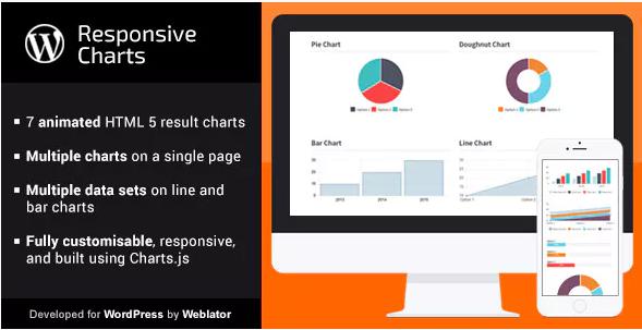
Responsive Charts is one of the best plugins for people who want an affordable option. It lets you create seven interactive charts that will look amazing on your WordPress.org site. The charts are made through charts.js and you can make radar charts, bootstrap progress bars, doughnut chart, pie chart, bar chart, polar chart, and line chart.
The charts can be easily inserted into the WordPress content via shortcodes or even though PHP as page templates. You can name your charts, define the width of the graph, and select your chart type. There are plenty of styling options that you can avail too such as padding, colors, typography, and margins. The data source is manual and can be accessed from the bottom of the page through different data sets. This WordPress chart plugin also allows users to upload the data through CSV file.
However, there is no way to preview your chart while creating it in real-time. To preview the chart and see any changes you have made, you will have to insert the shortcode into the content area itself. Only a premium version of the plugin is available, not free. Nevertheless, once you purchase it, you can upload large amounts of data and access a lot of styling options.
amCharts: Charts and Maps
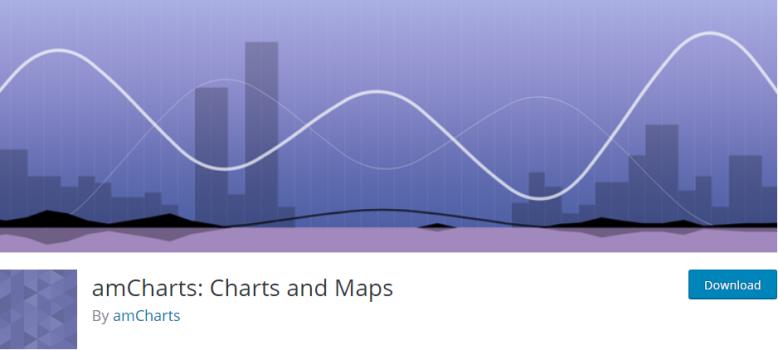
amCharts is the best plugin for more advanced WordPress bloggers and users who are past the basic simple tools that other plugins provide. This chart plugin has been developed through JavaScript and is a really great tool to make your WordPress site stand apart from the rest. You actually make your content page look really interesting with the 9 different chart types including:
- XY Chart
- Pie Chart
- Sliced Chart
- Sankey Diagram
- Radar Chart
- Gauge Chart
- Chord Diagram
- Treemap
- Map
You can also choose to store resources locally or remotely from the plugin settings area. You will also be able to add the custom resources to any JavaScript libraries on the plugin. Every type of chart can be defined through the JavaScript libraries and these settings will become the starting point from which you can edit further.
M Chart

M Chart is a free plugin that you can use to design fantastic charts in WordPress. You can use Highcharts libraries or Chart.js for your graph creation. You can preview the charts and remotely embed the charts through the general settings page. There are four types of charts that you can create with this plugin: column chart, bar graph, pie chart, and line graphs.
There is also a data table option that you can use. You can click on a cell in the table to add your data or values. You can also use a CSV file to upload the data on the plugin to turn into a unique graph. A unique feature of the plugin is that you can even export the chart data through a CSV file, which is not an option available in other plugin modes.
You can check the preview of the chart in the data section of the display. The preview will even update when you change the chart type. You can display a legend or change the height of the chart through the options available on your plugin. You can also select a unit or add a title on each axis of the graph. There are literally dozens of unit types such as website traffic, currency, distance and more to make your charts more dynamic.
M Chart is the best plugin if you want an easy way to add data to your content in an interesting way. However, it only has four chart types which can be a nuisance for people who want varied Infographics for their website.
UberChart

The UberChart plugin is for users who want an advanced solution to represent visual data. It has more than 30 customizable features per data set and 240 customizable features per chart. There are 10 charts that you can create through this WordPress chart plugin including horizontal bar charts, pie charts, area charts, bar charts, line charts, polar area charts, scatter charts, radar charts, and bubble charts.
You can also modify the charts later with a few clicks of a button, which is really great if you want to update them. You can also duplicate some charts to use them as templates for any new charts that you want to add to your WordPress site. You can import data onto the plugin using a CVS file. The best thing is that you can even copy and paste the data from an Excel or Google spreadsheet.
The default styling setup is also great, which is why a lot of people use it. However, it can be really fun to customize your chart designs and change everything from tooltips to titles and everything in between. There are several styling options including colors, margins, padding, radius length, and others that you can use to make your charts stand out more. You can also preview you the chart while you designing it through the settings page. The best part is that it supports multiple languages and can be used cross-browsers on multiple sites.
WP Charts and Graphs

The free plugin called WP Charts and Graphs is also really great for a user who wants a basic plugin model that is easy to use. You can make six chart types including a pie chart, line chart, doughnut chart, polar chart, radar chart, and bar chart.
All you have to do to add titles is add the corresponding data and titles for the graph. When you click the generation button, it will show you a preview of the chart with a shortcode. You can easily insert this shortcode into your WordPress content page to display the chart. You can also make really quick edits to the chart at a later date by modifying the values within the shortcode.
WP Charts and Graphs is designed to be a basic, simple tool for users that don’t want to waste a lot of time creating graphs and charts for their WordPress site. It has no dedicated settings page, no way to change the colors, and no page for old charts.
Data Tables Generator
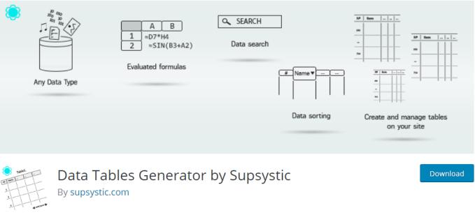
The Data Tables Generator by Supsystic has thousands of active installations for a major reason. The plugin allows you to create, display, and manage data tables from the main panel. You will be able to create plenty of interactive charts and graphs through this plugin to make your WordPress site look really interesting. It is available in two versions: a free version and a pro version.
There are multiple chart types available which you can use to make your blog look more dynamic and attractive. There are also different ways you can customize your chart displays. You can also render the charts for cross-browser and cross-platform, which is great for advanced WordPress bloggers. There is a built-in data table management system which you can use to manage all sorts of different data for different graphs. There are plenty of extended data types as well, meaning that you can import different kinds of data without an issue.
The functions of the table are varied, allowing users to play around. It can also be really quick and simple to add a table, simply by add number of rows and columns, as well as the title. The plugin allows you to edit through a spreadsheet, which makes it easy to add all the details. You can even add links, formulas, and images, which can make your data table easy to make.
You can also preview the table as you are designing it right from the tab on the plugin screen. You will also be able to access the CSS of the table so that you have the ability to customize it completely. Other features that are available in the settings tab include sorting and pagination.
The pro version is also really easy to use and is perfect for more advanced users. You can import and export data -the latter of which is a rare option to have. You can create different diagrams and charts from the data simply by selecting it from the table. There are seven types of charts that it creates such as line, area, column, pie, geo, gauge, candlestick, and scatter.
RJ Quickcharts

The RJ Quickcharts plugin is also really popular with users because of its amazing HTML5 chart options. You can also use CSS and JavaScript to create your charts. They are built and updated as you add data to them over time. Charts can be created through simple intuition, which is great for people who are just starting out. You can easily manage all the data through the WordPress interface itself.
The best part for beginners is that there are only a few settings that you have to tweak to create charts. This includes titles for the axis, legend display, and the colors of the chart. You can also add the data into the spreadsheet from the chart setup, which makes it a really easy way to input data. The plugin also provides a sample for the data, which makes it easy to set up your data table. The chart can be updated dynamically as you enter the data and you can see the changes from the preview option. You can also create a PNG file of the chart, which is useful if you want to add the chart to presentations and slideshows.
However, there are a limited number of chart types including line, bar, and pie charts which can make it difficult to add variety to your content. There are also no external data options and highly limited options are available for customization.
Using charts and graphs can be a really fun way to showcase data on your WordPress site. It is a really beneficial way to interact with your audience and make your site look even more credible.

Jon Dykstra is a six figure niche site creator with 10+ years of experience. His willingness to openly share his wins and losses in the email newsletter he publishes has made him a go-to source of guidance and motivation for many. His popular “Niche site profits” course has helped thousands follow his footsteps in creating simple niche sites that earn big.


